The Many
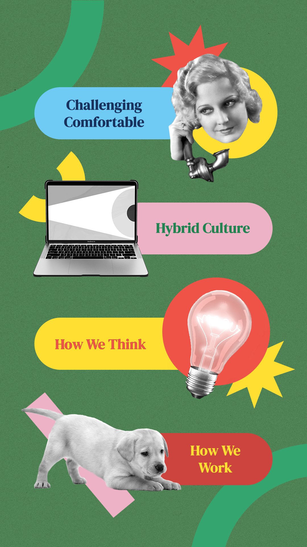
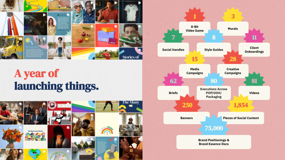
The Many Agency experienced immense growth in 2021, evolving from a scrappy startup to a refined mid-sized company. As a result, their brand identity needed to reflect this growth. By refining and implementing additional colors, illustrations, and layouts to their existing brand bank, I was able to further push The Many's vibrant and playful look. Additionally, I helped craft logos for internal Employee Resource Groups (ERGs), which aim to uplift specific communities at the agency. Lastly, a plethora of social and PR graphics were crafted throughout my time at The Many.
AGENCY
The Many
TYPE
Branding + Social + Digital + Illustration

State of The Many
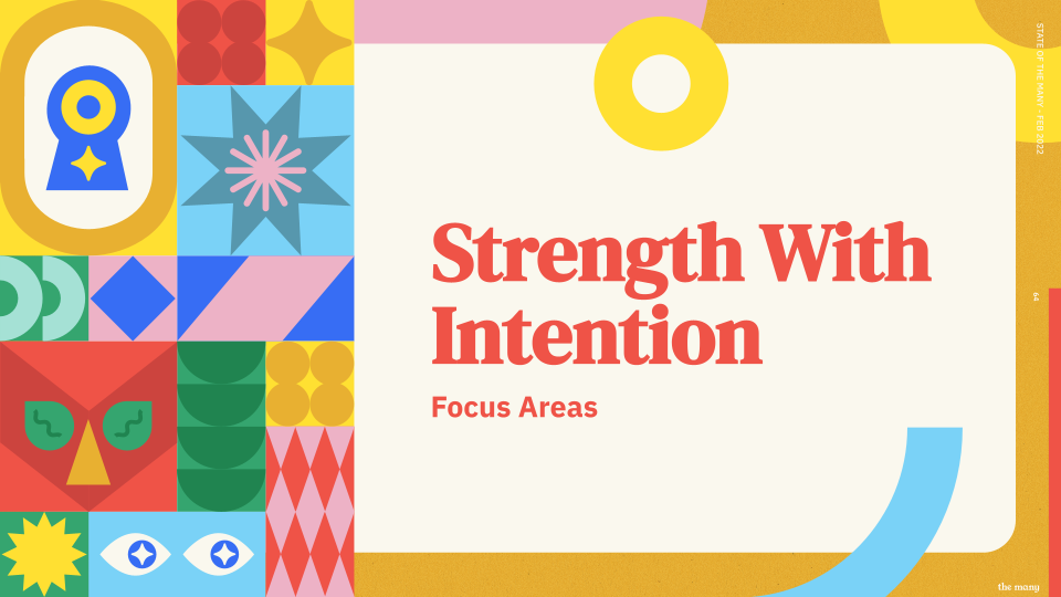
State of The Many (SOTM) is a biannual meeting in which the entire agency gathers to celebrate great work, applaud hardworking folks, and stay in tune with what’s to come in the future. It was at SOTM 2022 where we launched the updated brand identity, complete with new colors, illustrations, and presentation deck template layouts.


Pride at The Many
Pride at The Many is just one of the handful of Employee Resource Groups (ERGs) at the agency. ERGs aim to foster a diverse, inclusive workplace aligned with the organizations they serve. Various fruit sticker logos for the Pride ERG were carefully crafted with the agency’s existing visual identity in mind, and launched simultaneously along with social graphics for the Pride month campaign.
The fruit sticker concept is a not-so-subtle reference to “fruity”, a derogatory term used to describe LGBTQ+ people. The stickers aim to reclaim fruitiness as a badge of honor, while simultaneously creating a fun and vibrant identifier that truly represents the many diverse colors of the queer rainbow.


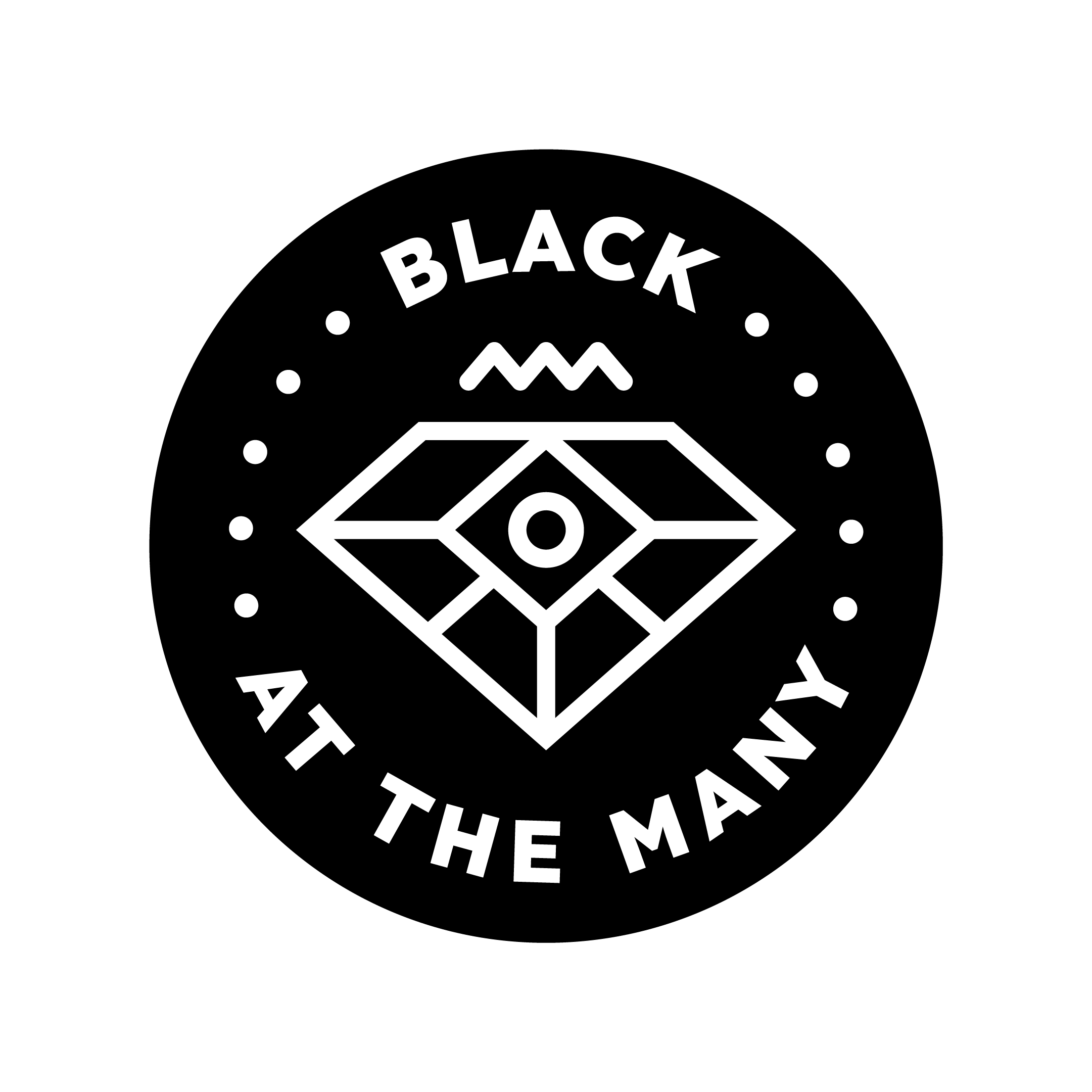
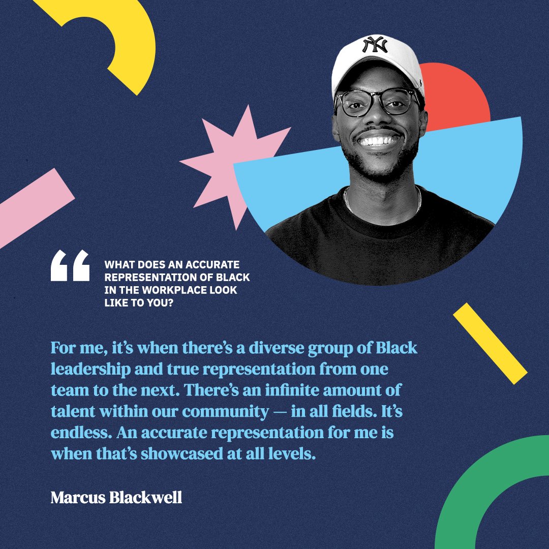
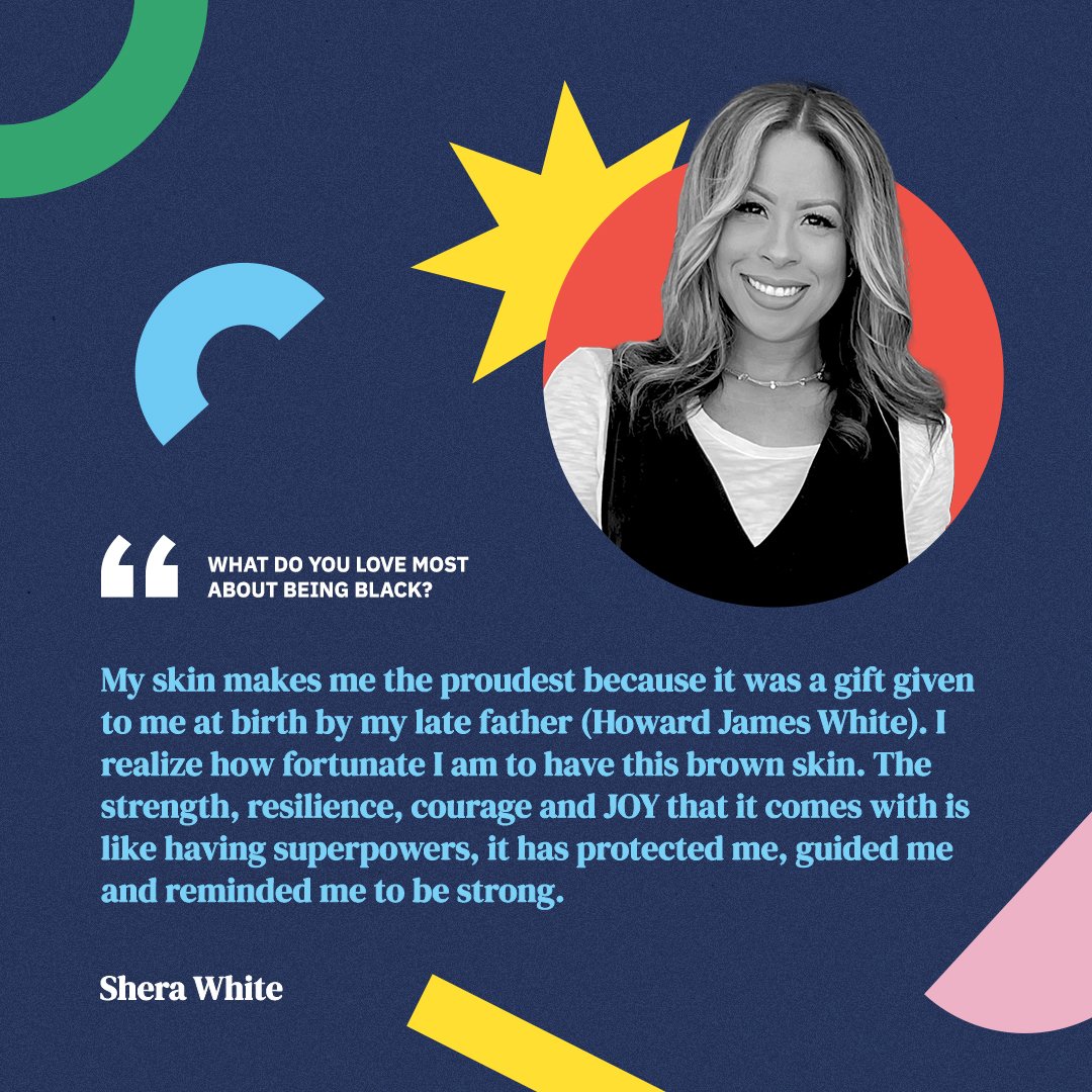
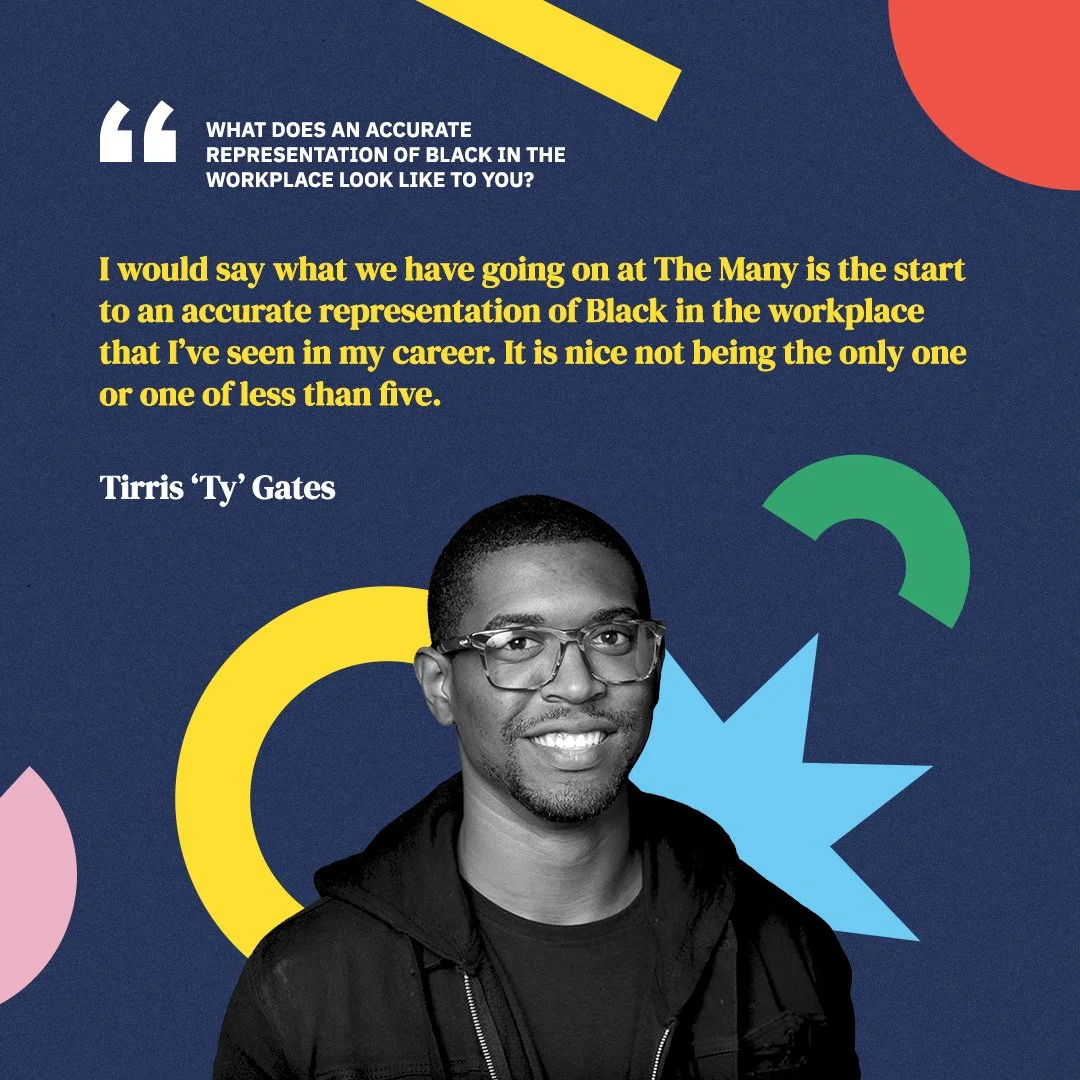
Black at The Many
Black at The Many is another Employee Resource Group (ERG) found at the agency. After a lengthy logo exploration process, the final concept was launched alongside social graphics for February’s Black History Month campaign. The final logo execution is heavily influenced by the diverse and colorful visuals of various African textiles & patterns, and takes a more typographic approach than some of its fellow ERGs.
Textiles have great cultural significance in many African cultures, and sometimes even serve as historical documents when written histories are not available. The use of playful shapes within the logo form doubles as both allusions to the vibrancy of Black culture and The Many’s existing visual identity. The geometric patterns, line work, and color choices also give it a more modern flavor.
Additional Logo Explorations


Miscellaneous
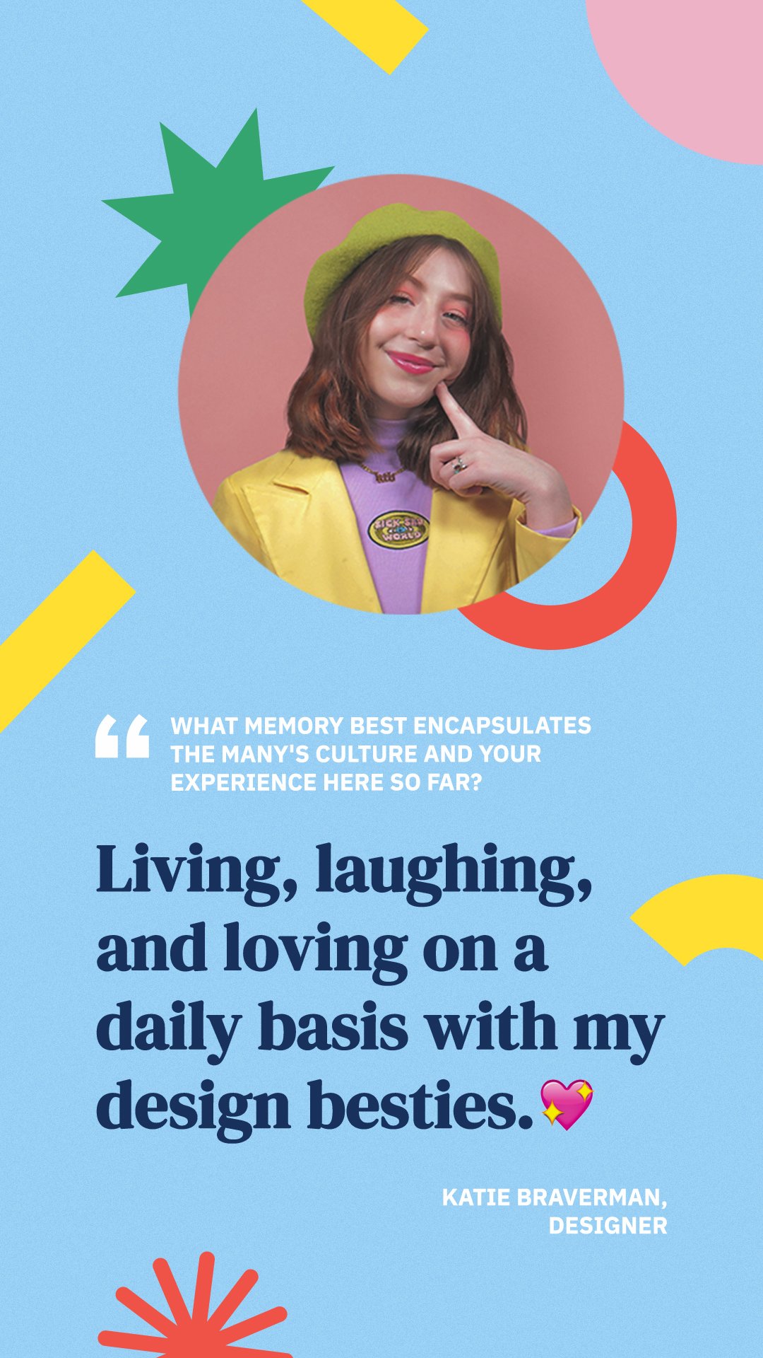
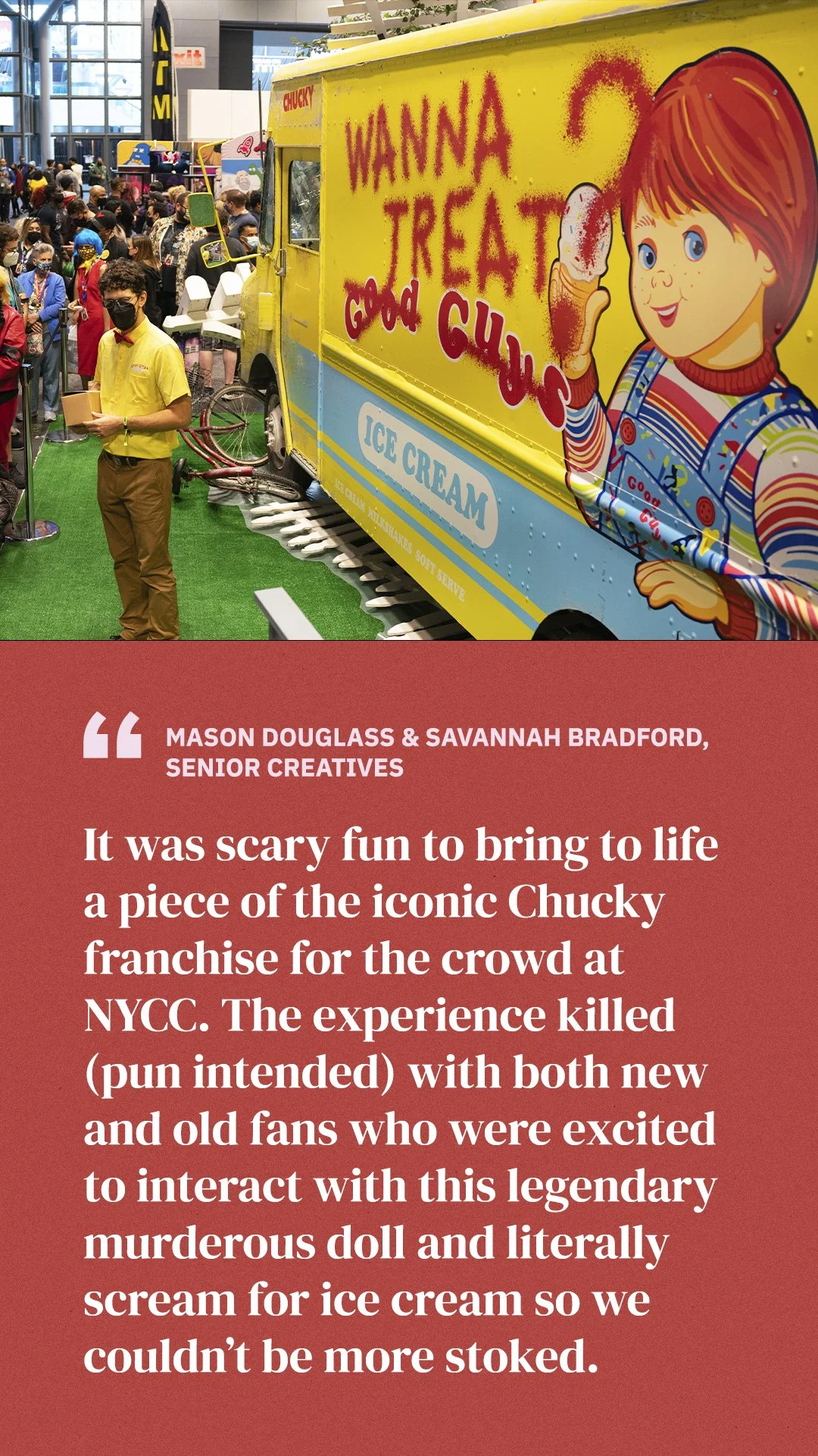
AdWeek spotlights, social posts interviewing parents of the agency, and horoscope birthday cards: you name it, we’ve got it!